Plot Dysbiosis
Arguments
- df
The data frame output from different dysbiosis calculators provided by dysbiosisR package.
- xvar
Variable to plot on x-axis.
- yvar
Variable to plot on y-axis.
- colors
colors to use for plotting. Default is NULL.
- show_points
Logical TRUE or FALSE.
Examples
data("WirbelJ_2018")
# data are relative abundances summed to 100 or
# near 100 val
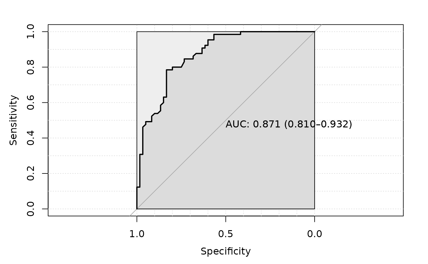
dysbiosis.oob <- dysbiosisOBB(WirbelJ_2018,
group_col = "disease",
control_label = "healthy",
case_label = "CRC",
seed_value = 1235,
add_tuneRF_params = list(ntreeTry=100,
stepFactor=1.5,
improve=0.01,
trace=TRUE,
dobest=FALSE),
ntree = 100, # increase for real data
plot_roc = TRUE)
#> The random seed of your session for reproducibility is: 1235
#> mtry = 23 OOB error = 20.8%
#> Searching left ...
#> mtry = 16 OOB error = 22.4%
#> -0.07692308 0.01
#> Searching right ...
#> mtry = 34 OOB error = 19.2%
#> 0.07692308 0.01
#> mtry = 51 OOB error = 17.6%
#> 0.08333333 0.01
#> mtry = 76 OOB error = 18.4%
#> -0.04545455 0.01
#> The mtry used is : 51
#> Setting levels: control = CRC, case = healthy
#> Setting direction: controls > cases

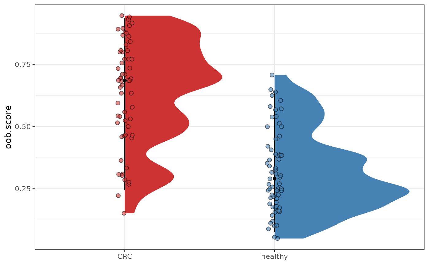
 plotDysbiosis(df=dysbiosis.oob,
xvar="disease",
yvar="oob.score",
colors=c(CRC="brown3", healthy="steelblue"))
plotDysbiosis(df=dysbiosis.oob,
xvar="disease",
yvar="oob.score",
colors=c(CRC="brown3", healthy="steelblue"))